iPhone 7
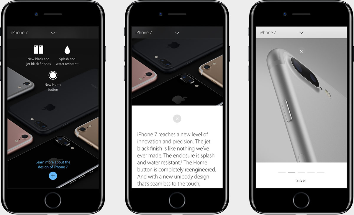
Our goal was to create a site that gave users a quick rundown of the new features coming to iPhone 7—and at the same time—tell the complete and comprehensive product story. To accomplish this paradoxical goal, we divided the overview page up by core features. Broke each down into three or four concise feature/benefits. And paired them with simple, glanceable iconography. This made a complex product story, quick and easy to digest. For users that wanted to deep dive, we built it all on top of a “drawer” interaction model that opened up to reveal the full product story. Visit archived site›

We wanted to make sure that the drawer interaction wasn’t disorienting. This was accomplished by setting apart the open/expanded state by using a contrasting background color. Giving the user a clear and consistent call to action. And using motion inference to help users understand the mechanism at play. It all came together as a beautifully simple, intuitive interaction both on desktop and mobile.